

Interactive Design & Persuasion
Design is much more than aesthetics and accessibity. There are also elements of persuasion, of temptation. Let's explore these and their applications.


Towards the end of last year, I became a bit obsessed with design generally. System design, UI design and more. I've had my share of failures with building sustainable or persuasive designs in the past, and every mistake is a chance to get better. This article was inspired by an awesome book: Evil By Design by Chris Nodder.
The book centred its theme around the "Seven Deadly Sins" and how they are leveraged against human weakness. Now this might sound evil and I agree, but twisted intentions always find a way to turn everything sinister and I promise, we won't be doing any of that. I would pick some of the "sins" and try to relate them to Software Engineering, especially building UIs.
Pride
Cognitive dissonance is a state where the brain tries to rationalize two conflicting concepts/thoughts, at the end of which, one must make way for the other. An example of where this takes place is expensive online purchases, where a customer tries to justify the cost of the items versus their need for them. This cognitive dissonance example has a name: buyer's remorse.
When building out interfaces for the user to interact with, this thing is kept in mind. And for a business to profit, it must make sales. A common way designers try to rationalise this dissonance is by providing reasons for the customer as to why they made the right choice. Enforcing the thought that the purchase or commitment was a good one. Methods of enforcement include:
Testimonials
Reviews (Social Proof)
Appealing Images (of important figures using it)
Awesome UI (presentation of the product)
These methods aren't new to us but are still very effective, even frameworks and tools now include testimonials and reviews on their page as a means for other devs to justify why they ended up picking that. For example "if so-and-so says it's good, it must be really good". Have you ever seen an item packaging and thought: "This must be good", either due to curiosity or just wanting to spend money?
Next, a lot of sites prime users to show off resolutions and achievements. And it's not difficult these days, all it takes is a tweet or Instagram post to tell the world. And this is where pride comes to play. Once a public commitment has been made, people tend to rationalize it and don't want to go against it.
Let's use Vercel as a use case. Vercel sponsors projects, and one of the criteria is for you to display the affiliation on your site. Now, this is great marketing because by seeing a lot of your favourite Open Source projects use Vercel, you tend to gravitate towards them or at least, see them in a different light. There are quite a lot of other platforms that use similar tactics, like getting something free when you post about it or a service in exchange for your contact.
How you can apply this to your next design:
Provide outlets for third-party testimonials to be seen. The more public it is, the better.
Invest in your UI. The first impression always makes a lasting impression
Never attempt to convince your users straight up. Instead, provide supporting reasons as to why you might be a good option. People never like sudden change.
Try and make the commitment public. DEV.to for example gives badges for varying writing streaks, this is a subtle commitment. People love status in the community and by giving them badges and featuring some write-ups online, you motivate them to write more because everyone can see the progress.
Try and get people to tidy up after themselves. People love a perfect public GitHub or LinkedIn profile, and LinkedIn encourages users to "complete" their profile by showing some progression ("your account is 25% set up"). This spurs people to give LinkedIn more information and also get an awesome profile. win-win.
Provide elements of assurance to your users. For example, if you have a subscription service on your site, users tend to give you a tryout when refund assurances are made vs when there are none. Another popular example is SSL certificates, I would be more comfortable browsing when your site has one vs when one isn't available.
Once you can get people talking, you can sit back and see engagements grow.
To leverage pride here, you aim to try and get users attached to your products, removing any mental barrier or thought that causes dissonance. Once they are attached, they take personal ownership of your product and then the pride sets in, giving your product better exposure. A cycle sets in where the user goes out to push your product, and others get convinced and then attached and it starts again.
Sloth
Sloth is the avoidance of work and a "don't care" attitude. Sloth leads to laziness which is a general trait in people. When designing a system or product, after identifying the end goal your users achieve from using your product, you try to build with the least path of resistance. The shortest path from A to B.
I learned something new whilst reading more on this. Users generally exhibit an F-Shaped pattern when reading web content, which can and should be leveraged when trying to pass a message across.
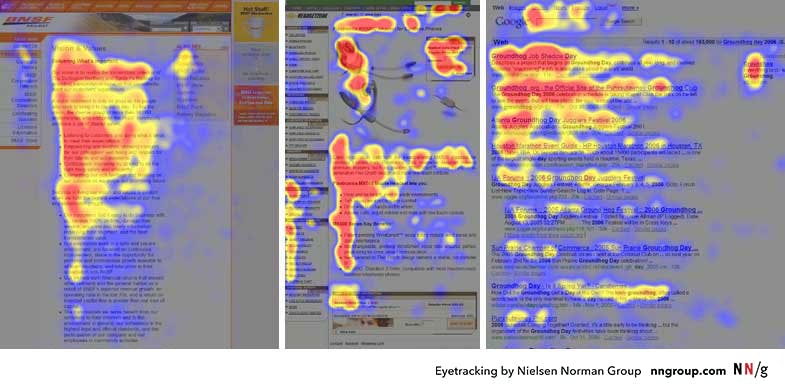
People have a lot going on in their lives, and unless they are die-hard fans, they won't spend all day going through every element on your page. So your goal is to maximize this short span and get as much info across whilst trying to hide details that might put a user off. Explaining the F-Pattern: users tend to scan the top of the page and then follow down the left side of the page, their eyes slipping into elements that catch their interest (e.g Headings, Bold texts, etc.)
When building anything UI including promotional emails, you want to draw their attention to elements you want them to and keep all additional info in other "grey areas".
Another way to leverage this is to reduce the options presented to customers to avoid procrastination with using your product. When fewer options are present, people tend to be less hesitant with choosing. If you can't provide fewer options, like an e-commerce catalogue for example. Provide filters so that it is possible to narrow down options at the end of the day.
Another strategy used by designers is providing a default option. When trying to make a payment, for example, there are usually selected options ("Yearly plan recommended"). And this default usually has an accompanying argument like $10 OFF, and remembering the effects of the sloth trait; users hardly try to go through the options. They just go with the default. Another example is when setting up your Windows OS.
There are more interesting approaches within the book but I would drop the pen here. In summary, build with laziness in mind. Your users would thank you for it.
Envy
There is this hype people tend to build around their product that seems to drive people off the rails. Whether it's an exclusive beta program or time-limited coupons and discounts for the lucky ones, there are these triggers put in place that drive desirability. And desirability is a force that drives envy.
Envy in the right dose can be helpful, seeing your favourite celebrity or programmer accomplish something drives you to strive to be like them. To learn more and drive more, now there is the hurtful envy where a person wishes harm to the other party. And this type of envy benefits none at the end of the day.
We've established that to drive a bit of envy, something must be desirable. Else people won't care. How do you drive desirability?
Secrecy: Being one of the few to know about it or partake in it (Beta programs)
Scarcity: When the item is not readily available (Coupons)
Identity: When the product is identified with a particular lifestyle, people (Apple devices)
Aesthetics: Pleasing to use and look at (Portfolios like this one)
Functionality: The product solves something no one else is solving (What is functional these days 🤔?)
Showing status difference and emphasizing achievement is also a powerful tool to drive envy which in turn drives desirability. An excellent case study is Discord, these guys mastered this craft when it comes to status difference. Employing multiple means to create status differences such as Nitro, a "boost" you buy that gives you a lot of perks and some very obvious badges. Another one was server levels, where you level up by chatting more in that server which unlocks some cool perks, badges and more in that server (based on the server admin's whims).
Another one that ties in with the two points stated above is allowing users to show off their status, again something Discord does well. These coupled with other genius ideas are what have grown Discord from a relatively small platform for gamer communities to a sprawling, online metropolis with billions in revenue.
Lust
Firstly, allow me to say that lust is not just akin to sexual, but describes when there is an intense desire for an item, in this case, your product. But first, you have to make people respond to your persuasion before they get attached to whatever you are offering them. But how do you even get them to listen? A simple answer is: flattery.
People love and appreciate acceptance and love from others. And even when insincere, people still tend to warm up to it or at the very least, be a bit more positive. A case study of this is LinkedIn, a business and employment-focused social media platform. When persuading people to buy premium, one of the methods used is telling people how many others viewed their profile and how they can view those that viewed their profile by paying x (IDK how much).
Another way to drive persuasion and desire is curiosity. People get curious when things are done outside of normalcy, and the why pushes people to investigate. An example is when Avis marketed itself as the second-best in the early 1960s. Or framing your message as a question instead of a statement, people try to mentally answer it which can lead to interesting results.
My last point from this chapter which still works till tomorrow is making things free, it might not entirely be free (like 2-in-1 sales work better than saying '50% OFF!'). Free shipping is a relatable case study, I feel more inclined to buy stuff internationally when I see a free shipping offer. We just love free stuff and amazon were one of the first major business to introduce such into their business model, and they made a profit from this.
That's another article wrapped up! Thank you so much for reading. This book expanded my perspective and gave me some interesting approaches to approaching design. I would seriously recommend giving it a read even if you aren't into tech, as these are principles that can be applied to any field that involves human interaction. I intend to keep improving, keep learning and just be the best version I can be in this life. Keep learning, work smart and play hard. Would see you in the next one 👋